A taste for terroir: the evolution of the Australian wine label
Some Australian wine labels haven’t aged well, but more recent creative designs reflect a globalised country and reveal much about our emerging winemaking terroir, write Moya Costello and Robert James Smith.
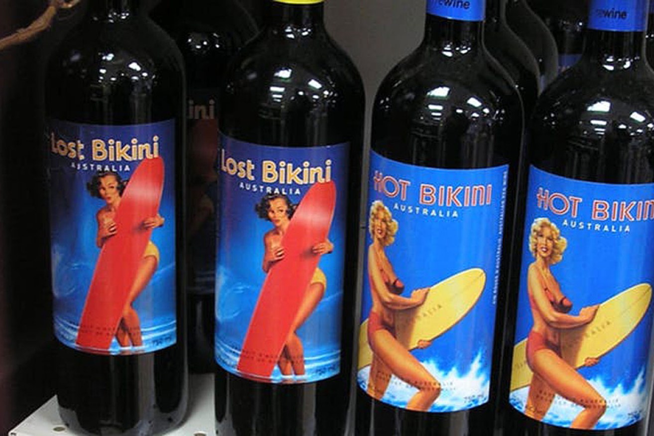
This Australian wine label echoed 1950s’ holiday postcard images of beachside sauciness.
While we can tell the most about wine by drinking it, the door into this experience for bottled wine is the label. Clearly important from a marketing perspective, most Australian labels also communicate much more about a company, a grape variety or blends, and the drop’s place of origin.
The labels of French wines are a cryptic introduction to French geography and that elusive quality, terroir – now considered to mean not only nature but its complex relationship with human intervention.
But our local labels, too – those small, focused narratives attached to bottles – can tell us much about Australian history, geography, identity and, indeed, terroir.
Some labels have not aged well. In the late 19th century, a Yalumba wine promotion juxtaposed images of Indigenous life with those of settler/invader wine-making.

More recently, a contemporary Australian wine was marketed in North America in 2007 under the labels of Hot Bikini and Lost Bikini. These labels echo 1950s’ holiday postcard images of beachside sauciness — without giving a grape variety or zone/region more specific than “Australia”.
Both these labels have an awkward sense of place. But what of some more successful examples?
Jamsheed
Gary Mills, in the Yarra Valley region, has named his boutique label Jamsheed. It acknowledges the ancient and mythic history of winemaking, and resonates with a globalised, multicultural Australia.

Jamsheed was a Persian king whose fondness for fresh grapes led him to store them in jars where they spontaneously fermented, making wine. Mills’ Jamsheed label has a continuous Middle Eastern-type pattern, reminiscent of the architectural flourishes of the Alhambra, coloured for the wine inside.
Ashton Hills
Is winemaking an art? The Australian wine critic James Halliday has concluded “most would say so”. We see wine labels, as well as winemaking, as creative, and labels often acknowledge art works in their design.
Ashton Hills, for instance, has a hand-rendered watercolour, implying that the Adelaide hills are cooler and more lush than its hot, dry plains, making for a differing wine style.

Schild
The photography on Schild labels, from the Barossa Valley, represents different family members and farm detail. Everyday humility is indicated by a rusted car body (Merlot) and the lower legs of a tired worker (Cabernet). Delight in specific detail is indicated by the seemingly random sight of the feet of a chicken standing on a barrel (Chardonnay) and then, most powerfully, in the elderly worker’s hands trying to enclose the rich soil (Shiraz).
Black Squid Studio’s designs express labour, age, and honest earthiness. Schild emphasises that all this work is done in one region as “estate grown”.

Cassegrain
 When Cassegrain’s dominating silver circle is taken into the border of the label, it becomes the “C” of Cassegrain, in NSW’s Hastings Rivers region, but also, in full circle, the company’s sub-label, Stone Circle.
Cassegrain’s elegant minimalism is rendered in white, black, and silver. The circle is presented in full on the top of the cap, making the bottle immediately recognisable when laid down.
This label also names its selection of grape-growing sites across NSW: Orange, Rylstone, Tumbarumba, New England, Cowra and the Hunter Valley.
Richfield Estate
Richfield Estate chooses to mark out its singular grape-growing area in the New England region of NSW with labels that feature an abstraction of a map’s aerial view. It perhaps also attempts to reference a famous European painter: say, Piet Mondrian or Fernand Léger.
The vineyard’s location is delineated by a small gold rectangle. The crossroads are angled differently for each of the varieties.

Topper’s Mountain
Topper’s Mountain labels are the result of the designer’s encounter with New England’s red soil. The soil dust seemingly seeps into vineyard tools and clothing, a bucket and a boot.
By implication, the soil has seeped into the wine, expressing an earth-based terroir. The red is reinforced in part of the text. The owner of Topper’s Mountain is the vigneron Mark Kirkby. And the wine is made by Mike Hayes of Symphony Hill, in the Granite Belt Region. Here, the relationship of nature and culture is acknowledged.

Jilly Wine
NSW winemaker Jared Dixon has used hessian or denim-like labels to signify vineyard labour for his artisan label Jilly Wine.
Without a vineyard of his own, he uses what is at hand on Kirkby’s New England vineyard, making eclectic mixtures, often with more than three varieties listed in hand-writing on labels. His reds can be a combination of Nebbiolo, Shiraz, Tempranillo, Tannat, Pinotage, Tinta Cao, Touriga, Barbera, and the whites Gewürztraminer, Chardonnay, Viognier and Petit Manseng

These labels show how the growing place of wine in Australian life – its land, stories, and imagination – is accompanied by an emerging Australian terroir.
Dr Moya Costello is an adjunct lecturer at Southern Cross University and Robert James Smith is inaugural vice chancellor’s fellow at Southern Cross University. This article was written with the assistance of Leonie Lane, graphic designer, Booyong Design. It is republished from The Conversation under a Creative Commons licence.